Overview
Opus1 is an all-in-one platform used by private performing arts academies to manage scheduling, billing, and client communication. Teachers primarily interact with the system through a calendar-first workflow that structures their day around back-to-back lessons.
While Opus1 has a robust administrative backend, its communication features do not align with how teachers actually work. Unclear structure and inconsistent language lead many users to rely on external tools such as Google Docs and email. This fragmentation increases cognitive load and raises the risk of lesson information being lost or inconsistently documented.
Problem
Teachers, who are the primary day-to-day users of Opus1, need a clear, reliable way to document lessons and communicate with students and parents.
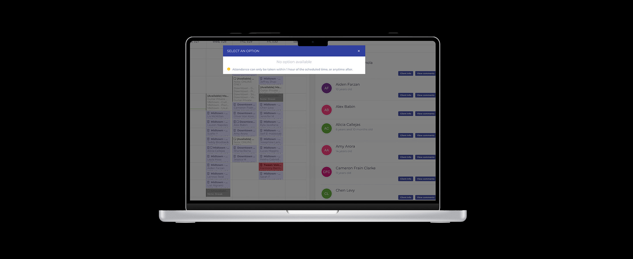
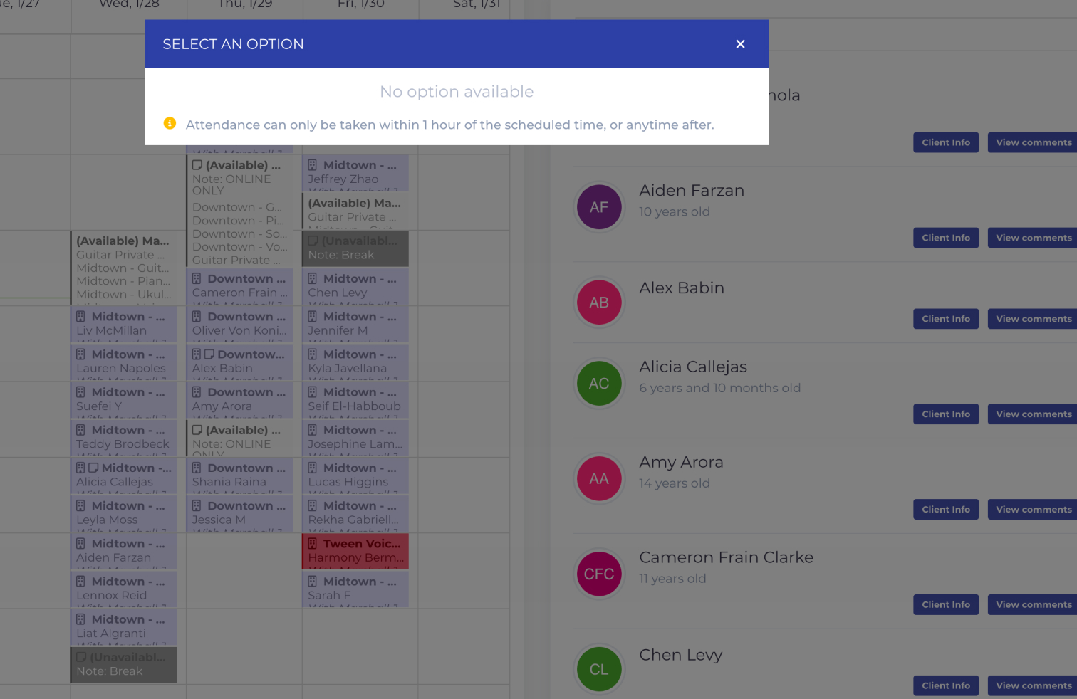
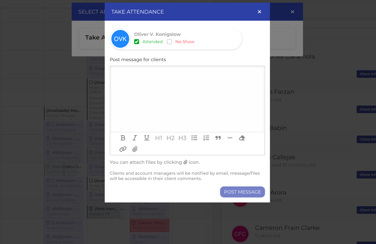
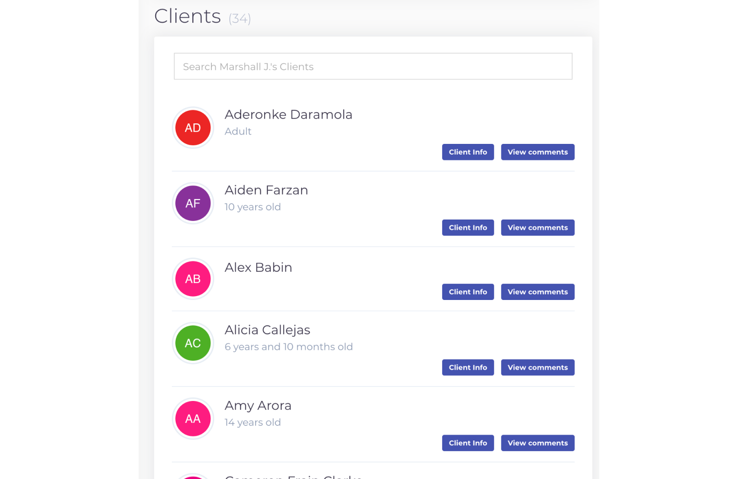
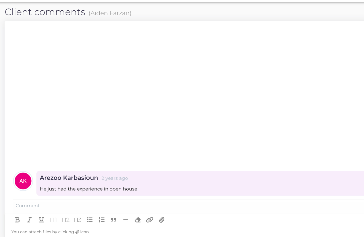
Although Opus1 includes a messaging feature, the current interface implies that messaging is temporary, conversational, and tied to attendance. This creates confusion about when and how the feature should be used, and leads users to incorporate third-party software.
Show what each medium adds.
The current interface teaches users that messaging is temporary, conversational, and tied to attendance.
Design Constraints
Insights
Opus1 already contained the necessary functionality, but there was a misalignment between the system's intended mental model and what it communicated through its language, visual hierarchy, and interaction patterns.
The platform was designed to support structured lesson documentation, yet the interface presented communication as casual messaging.
Aligning the interface with the intended mental model became the central design challenge.
Aligning the interface with the intended mental model
became the central design challenge.
Design Principles
Solution
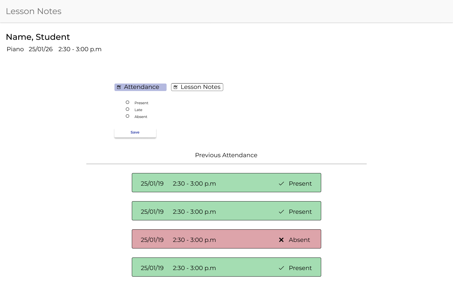
The redesigned experience reorganized communication around the natural flow of a lesson: attendance, instructional notes, and client communication.
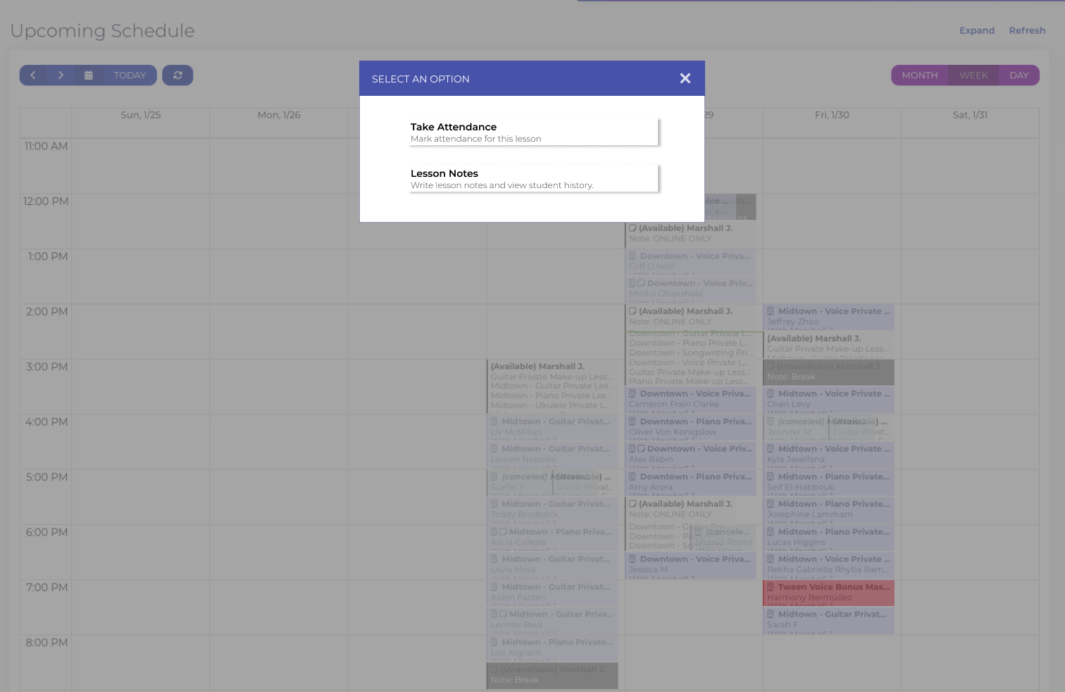
The calendar, which serves as the primary entry point to the system, was reorganized to emphasize two core actions:
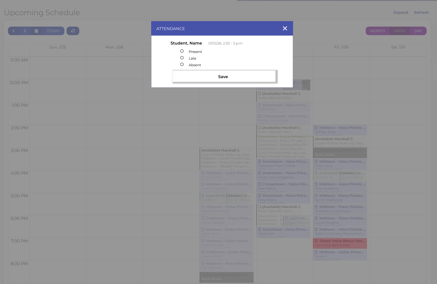
Selecting Take Attendance opens a lightweight modal, allowing teachers to quickly record student attendance without disrupting the lesson workflow.
Show what each medium adds.
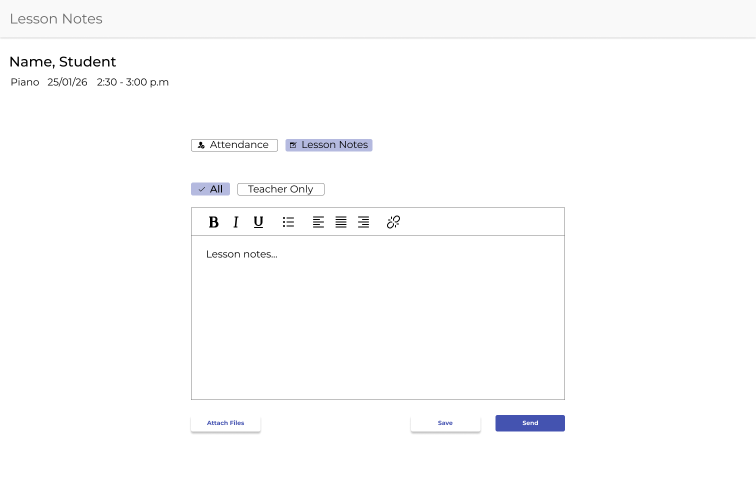
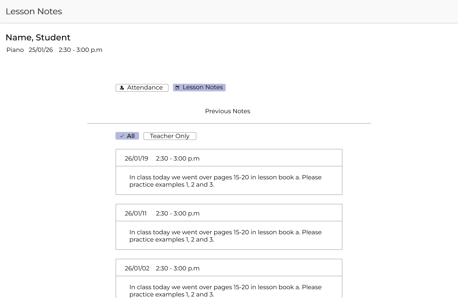
Selecting Lesson Notes opens a dedicated workspace where teachers can:
Show what each medium adds.
By separating attendance from lesson documentation while keeping both within the same lesson context, the redesign reinforces the platform's intended mental model: a unified instructional record rather than a messaging application.
The redesign reinforces the platform's intended mental model
Key Decisions
1. Separate attendance and lesson notes
Attendance is recorded at the beginning of class, while lesson notes are
written throughout or near the end of a lesson. Separating these actions
supports the natural rhythm of teaching while reducing friction during
instruction.
This distinction also clarifies that lesson notes are a persistent
instructional record rather than casual messaging.
messaging portal.
2. Reframe communication as documentation rather than chat
The original interface resembled conversational messaging. The redesigned interface instead uses patterns closer to structured email and archival lesson documentation.
This better reflects how most academies communicate with students and parents while supporting attachments, lesson history, and longer-form instructional communication.
conversational messaging.
3. Unify terminology across the system
Terms from the original design, such as “messages,” “comments,” and “notes” were consolidated into a single term: Lesson notes.
Using multiple labels for the same function created ambiguity about purpose and permanence. Standardizing the language reinforces a more predictable mental model.
"Messages" and "Comments."
under a single term: Lesson Notes.
Outcome
Clarifying the purpose and structure of lesson notes reduced ambiguity around teacher-student communication and removed the need to employ third-party products as workarounds.
This benefits Opus1, the academies that use the product, and the teachers who engage with it on a daily basis.
Through this project, I deepened my core UX belief that clarity and thoughtful design are significantly more important than expansive features or updated UI’s. By taking time to understand how people actually use a product, clarity can be created, making the user's life easier and increasing the chance that they will stick with their product of choice.