Overview
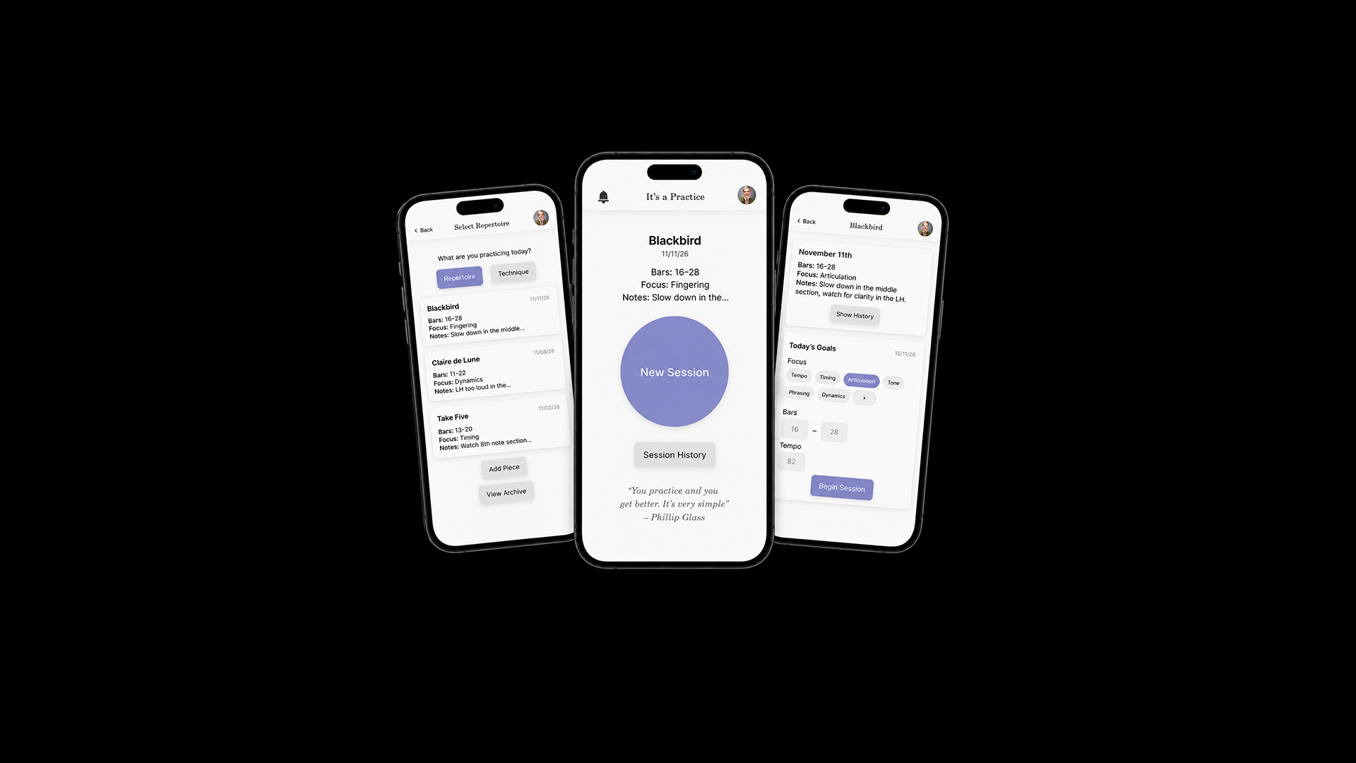
It's a Practice is a mobile application designed to support focused music practice through reflection. Developed for serious musicians, the project explores how digital tools can complement study routines without competing for attention.
Many existing practice applications rely on timers, streaks, notifications, and performance metrics to encourage engagement. While these approaches can be effective, they often introduce additional interaction into activities that require deep concentration. This project explores how a digital product can support musical development while remaining secondary to the practice itself.
Problem
Serious musicians practice as part of a daily routine that requires focus and repetition. Existing practice apps are often designed for beginners or rely on metrics, timers, notifications, and interaction patterns that interrupt concentration.
As a result, many experienced musicians avoid using their phones during practice altogether.
The central design challenge became:
How might a digital tool support focused practice and meaningful progress without disrupting focus?
Design Constraints
Insights
Through interviews, it became clear that experienced musicians already track progress through annotations, practice journals, repetition, and self-reflection. Many are also wary of introducing technology into their practice routines, as digital tools can compete for attention and disrupt concentration.
This suggested that the problem was not a lack of tracking tools, but the way many existing apps demand interaction during the practice session itself. For a practice app to provide meaningful value, it would need to support organization and reflection while remaining largely invisible during practice.
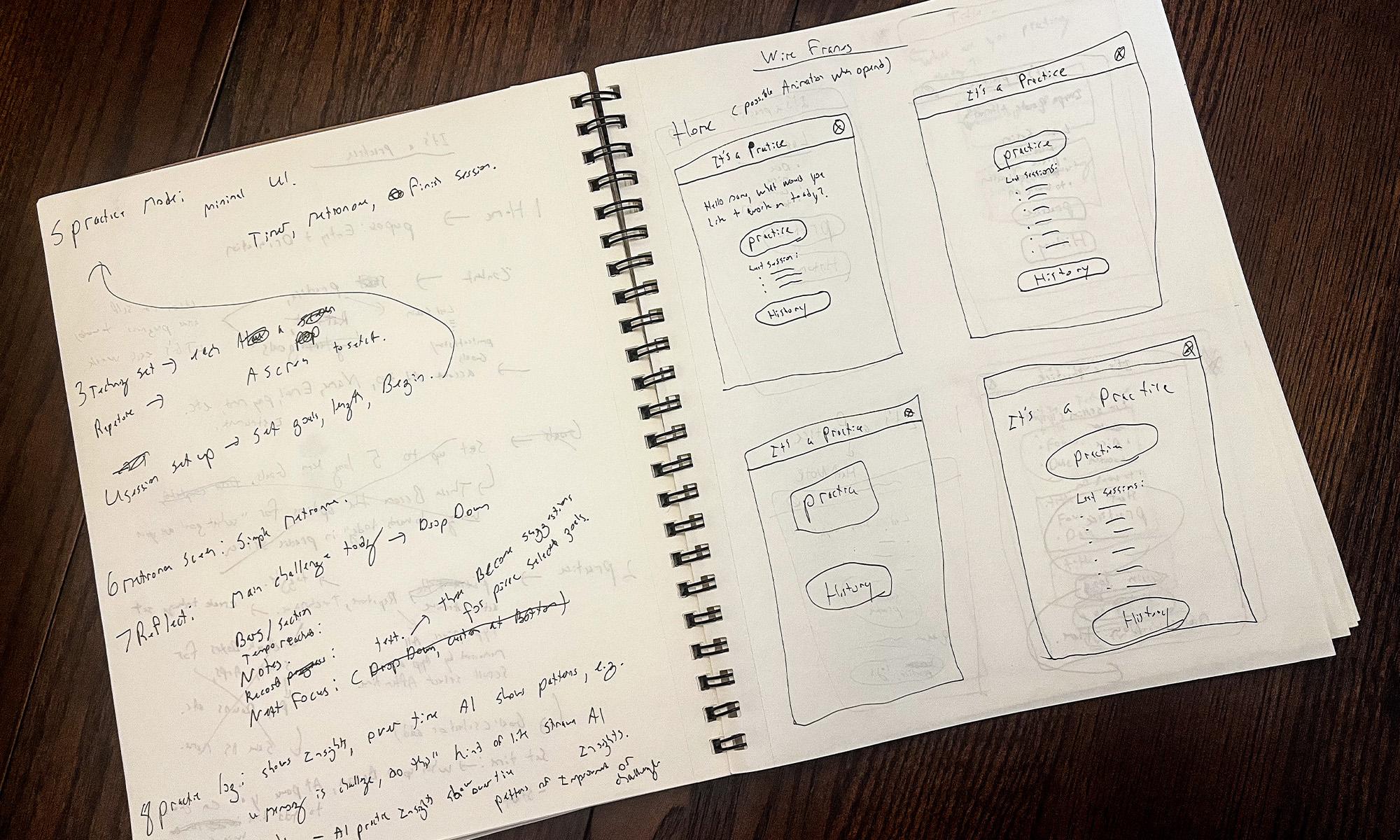
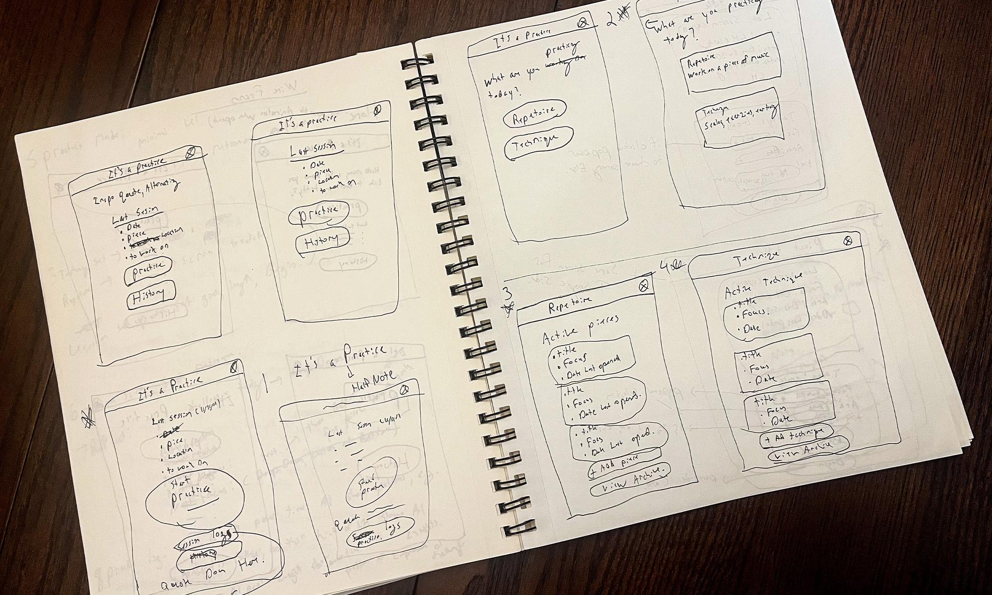
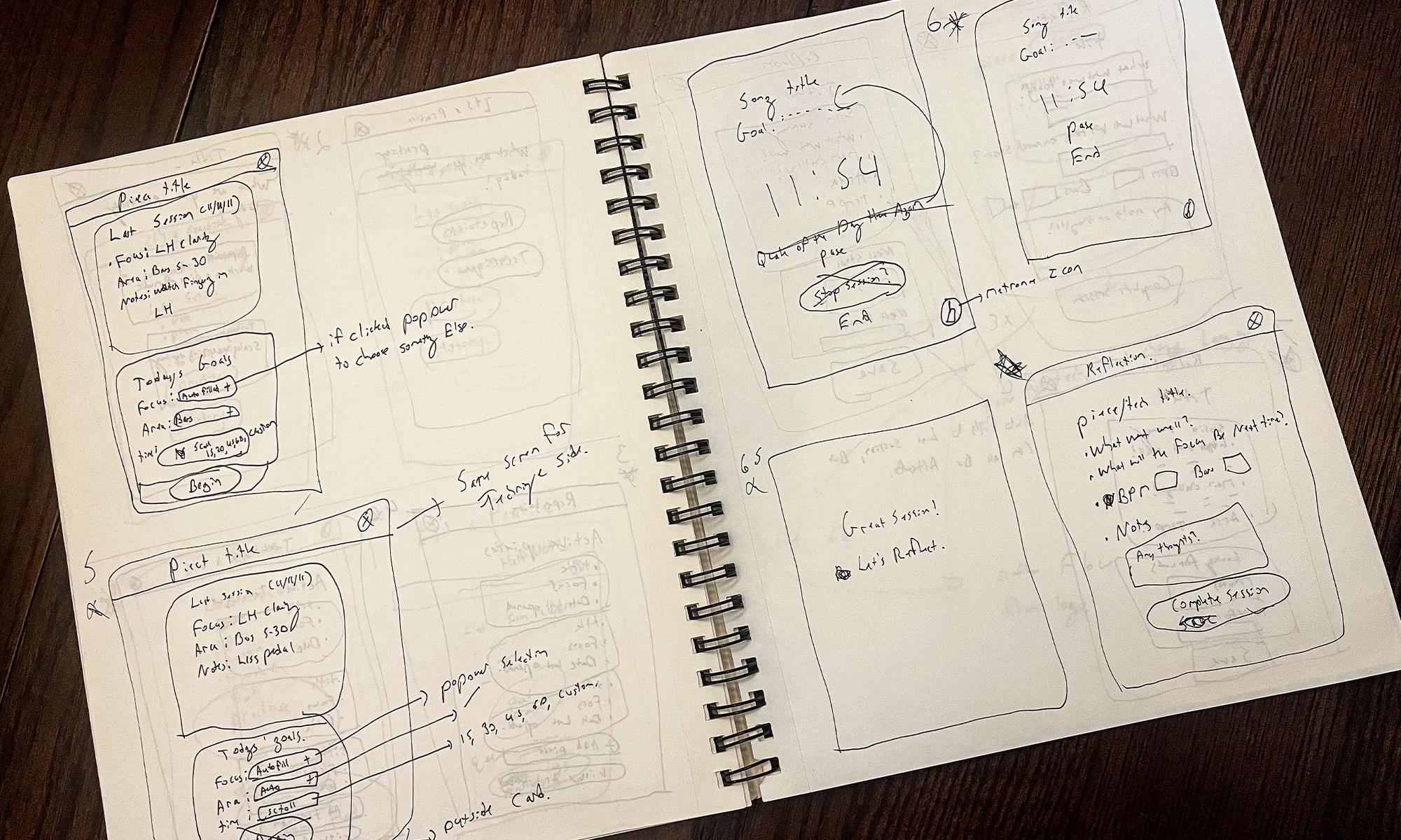
For a practice app to provide meaningful value, it would need to support organization and reflection while remaining largely
invisible during practice.
Design Principles
Solution
The app is built around a simple three-stage workflow that mirrors the practice routine many musicians already follow. Rather than introducing new behaviours, the experience supports existing habits through a streamlined process focused on preparation, practice, and reflection.
Start Session
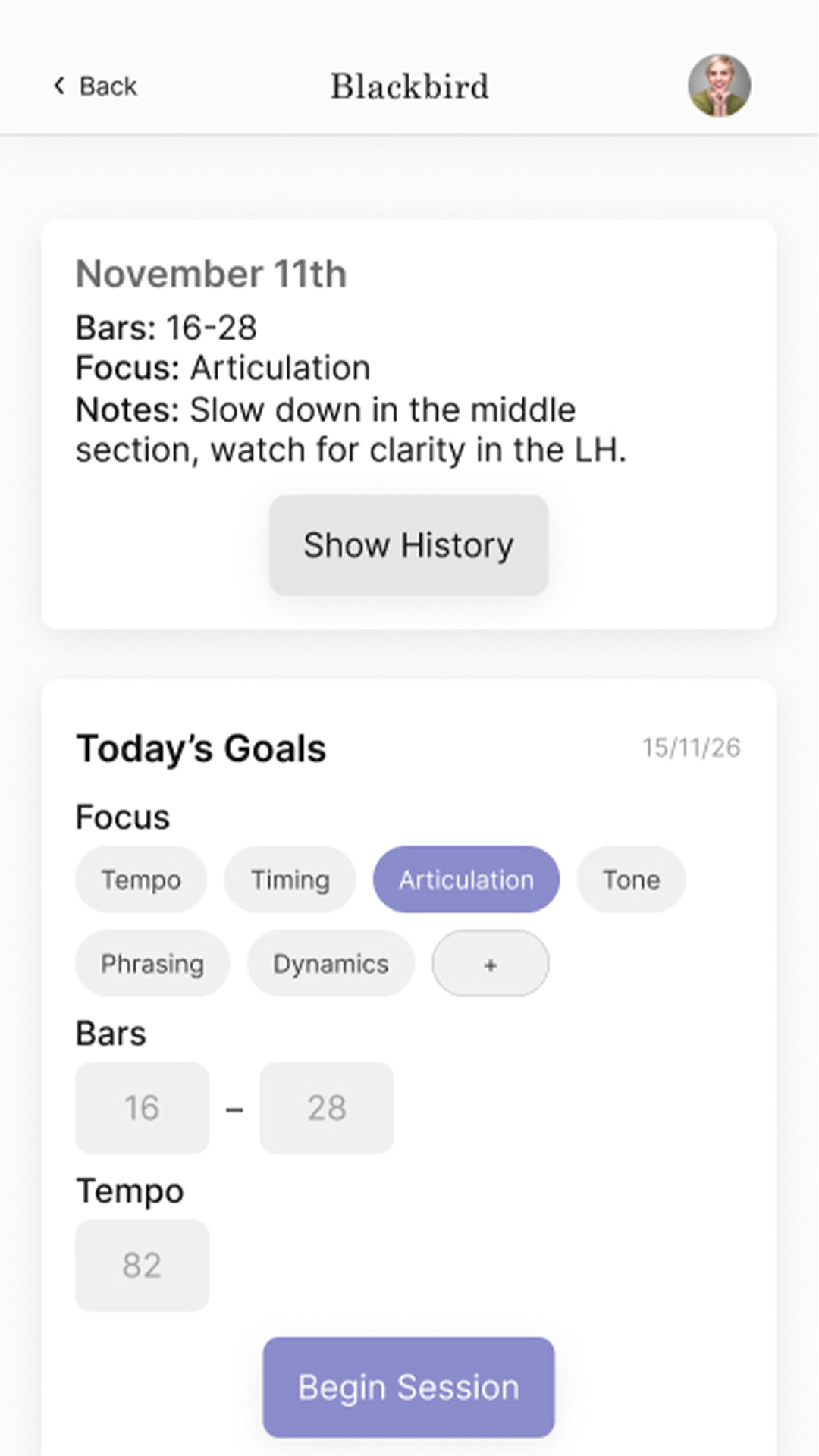
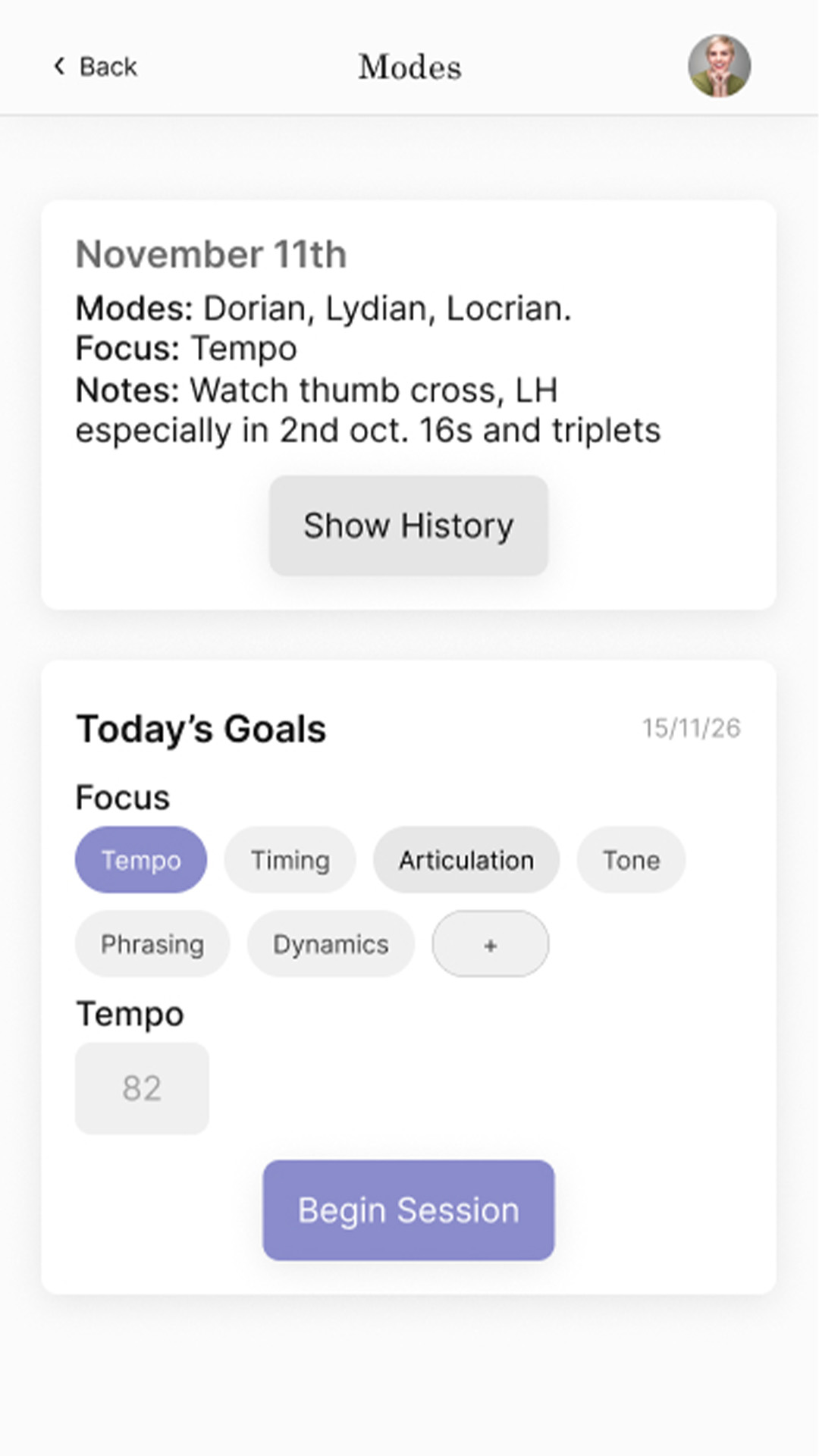
Users begin by selecting a piece and defining a clear practice goal. The streamlined setup minimizes decisions, allowing sessions to start quickly while keeping attention on the instrument rather than the interface.
Home screen
Practice
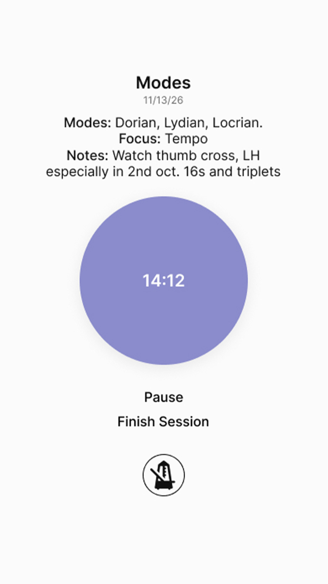
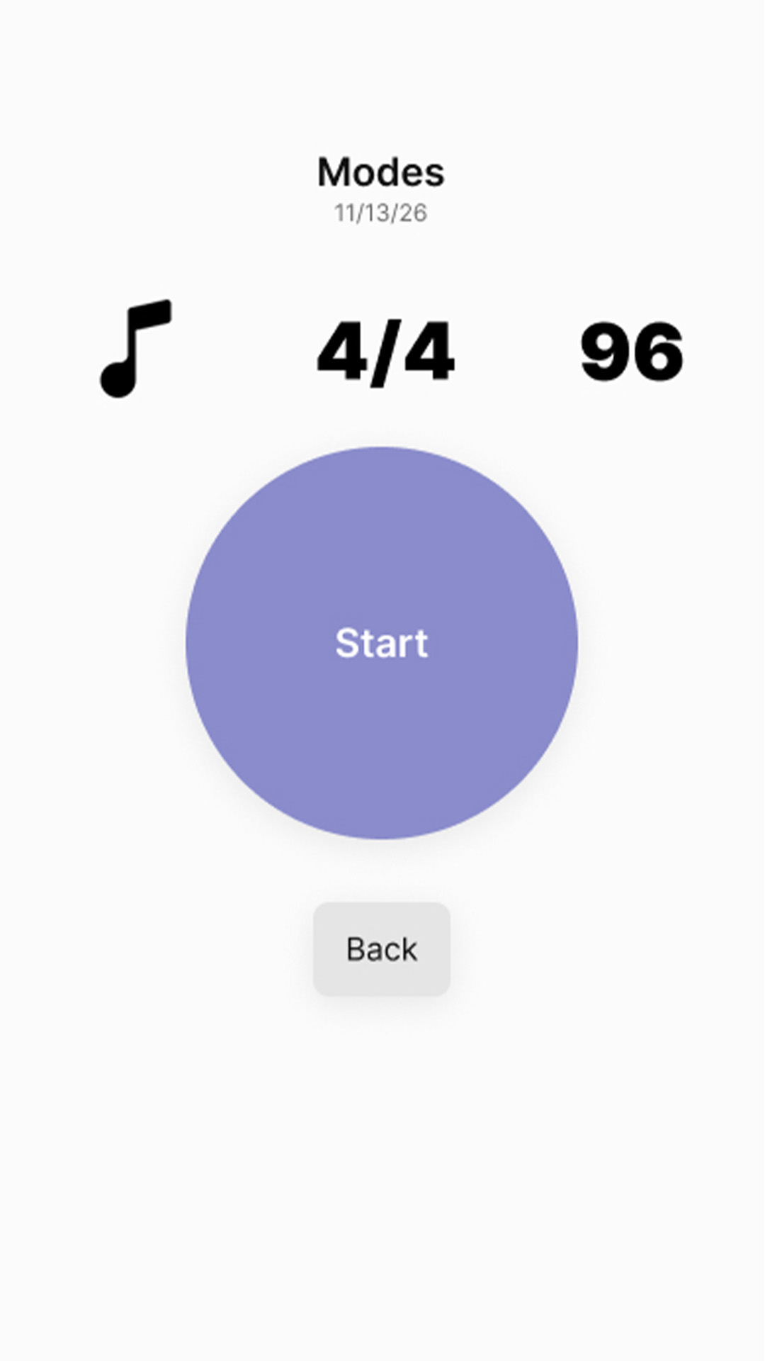
Once practice begins, the interface becomes largely passive. Only a timer and metronome remain available, minimizing distractions and keeping attention on the instrument.
Home screen
Reflect
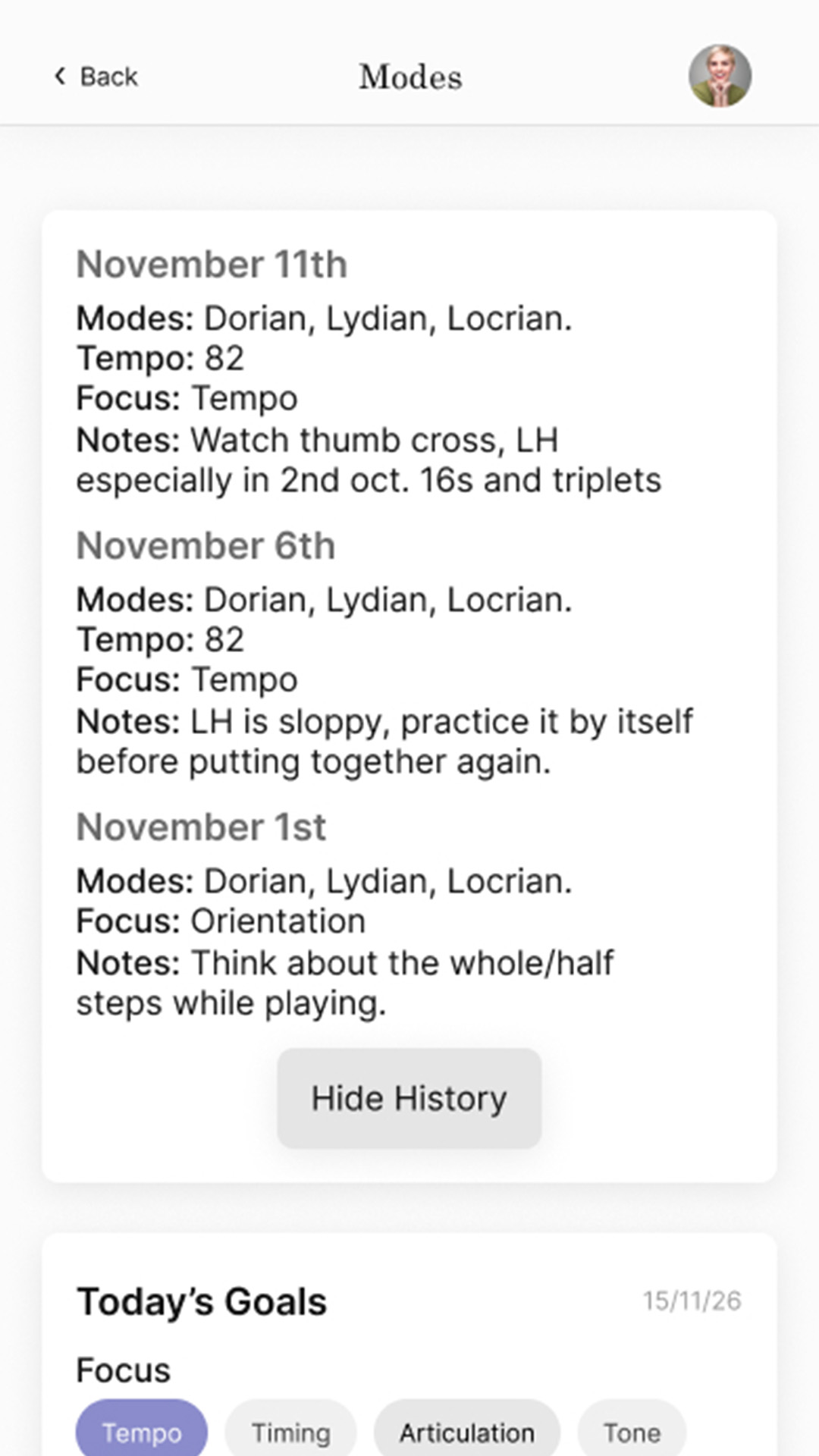
After each session, users record reflections, track practice time, and update their progress. Capturing these observations creates a structured history that supports long-term improvement.
Home screen
Key Decisions
UI Design
The app is built around a simple three-stage workflow that mirrors the practice routine many musicians already follow. Rather than introducing new behaviours, the experience supports existing habits through a streamlined process focused on preparation, practice, and reflection.
Typography
Two typefaces are used: Academico for display and Inter for content. Academico references traditional sheet music aesthetics, adding a sense of familiarity and authority. Inter provides clarity and readability for functional text.
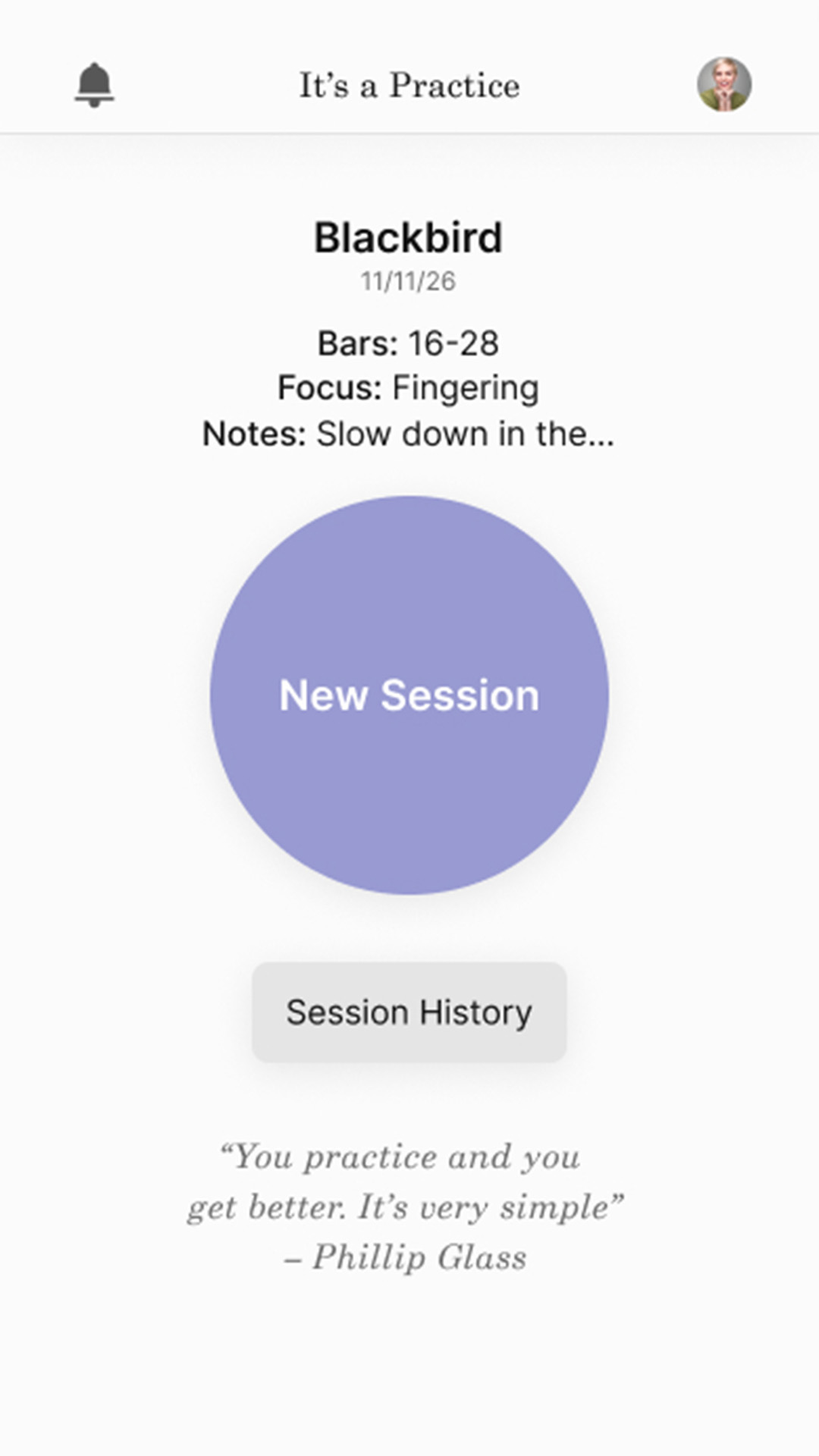
Home screen
Spacing
A consistent spacing system (16, 24, 32px) maintains rhythm and clarity across screens.
Home screen
Color
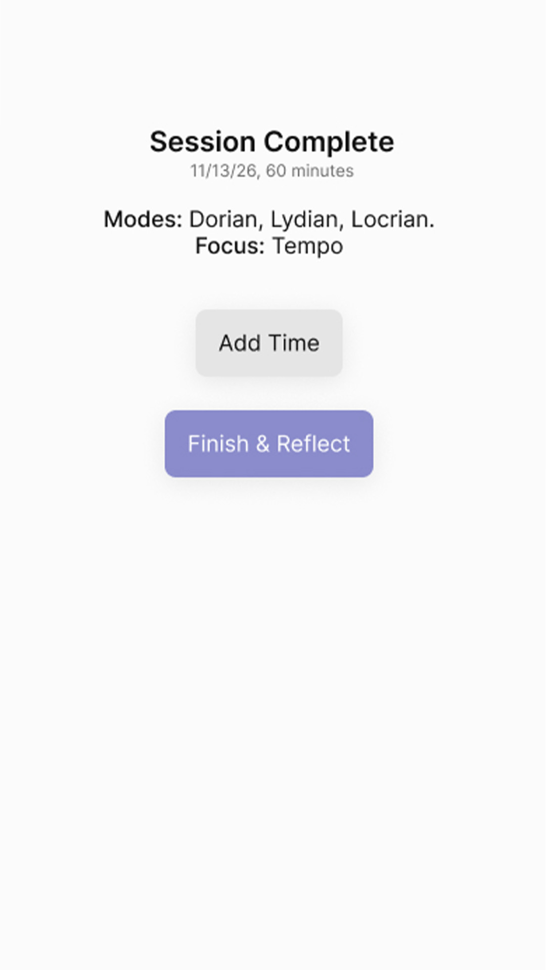
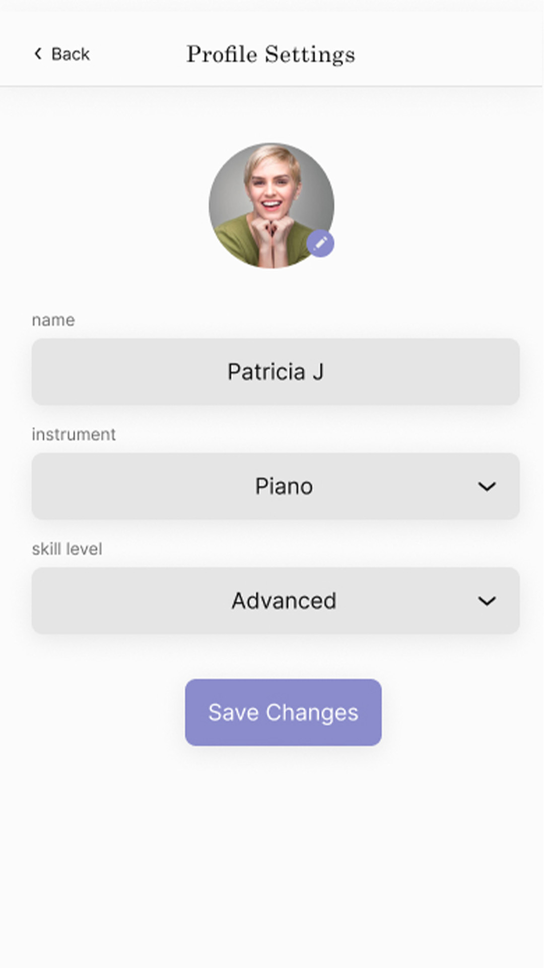
A restrained palette uses black, white, and grayscale for hierarchy, with lavender as an accent for primary actions and selection states.
Home screen
Components
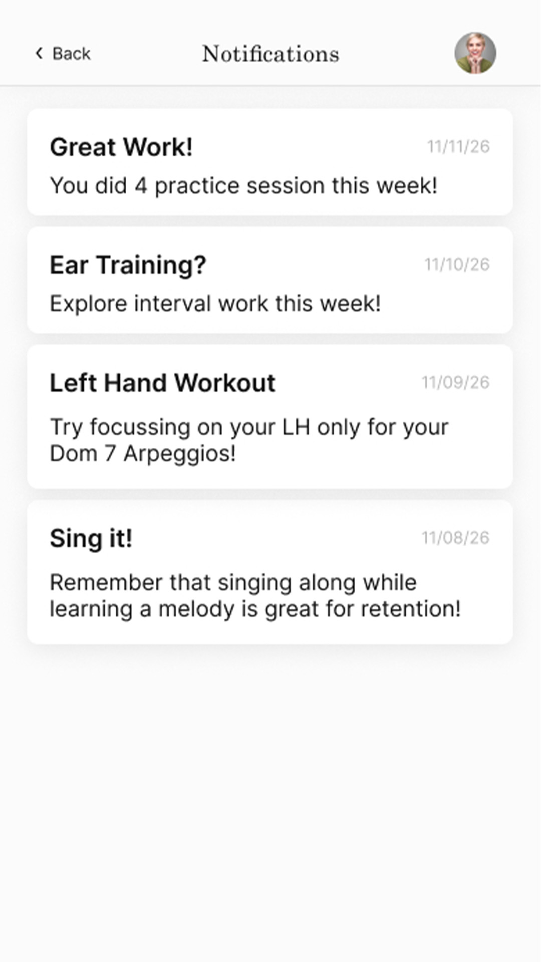
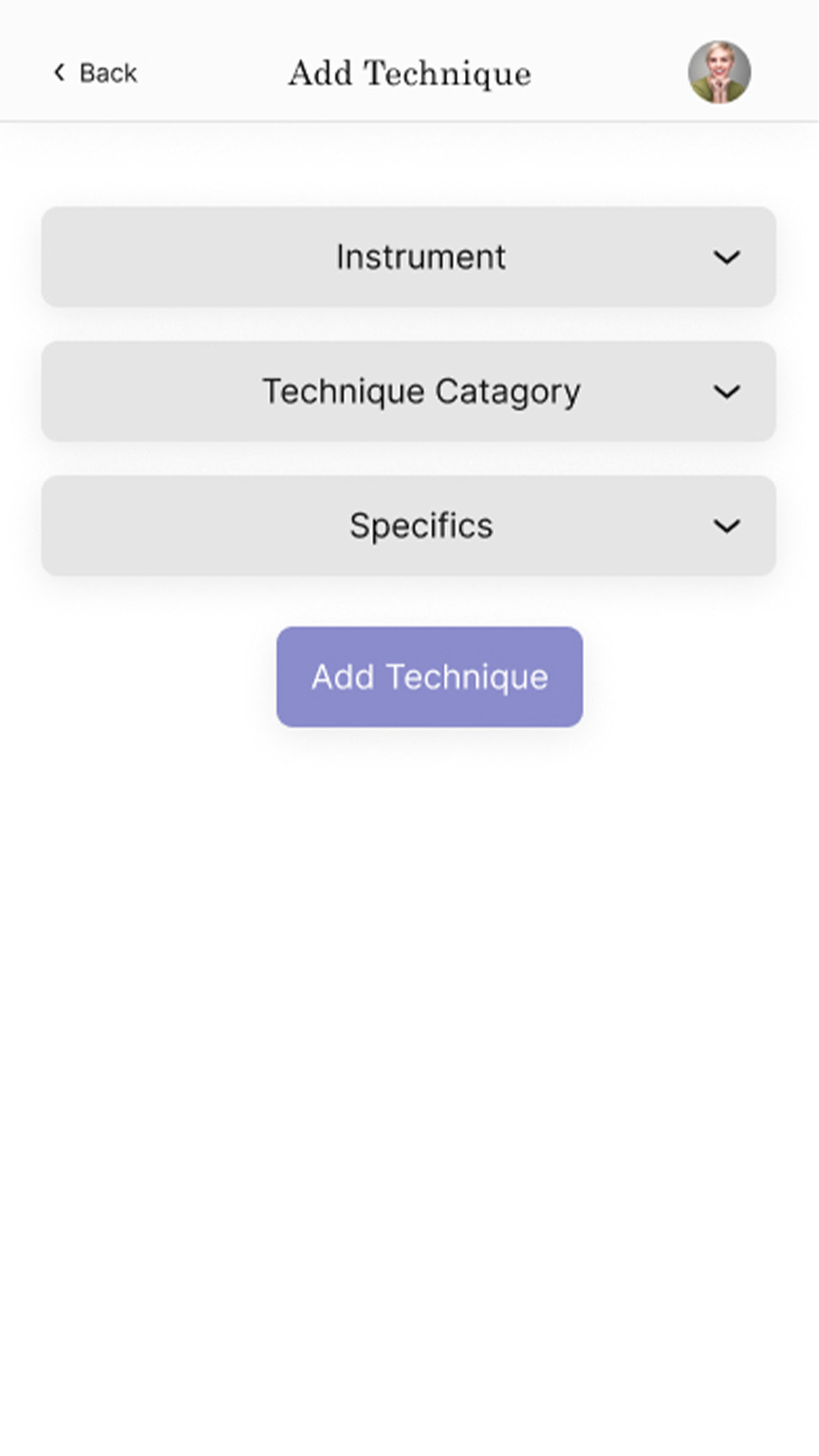
Reusable components were used for buttons, cards, and headers to ensure consistency across the interface.
Home screen
Outcome
Initial feedback from five musicians indicated interest in incorporating the app into their practice routines, suggesting the concept aligns with real user needs.
This project highlighted the challenge of balancing flexibility with simplicity. While the app must support varied practice styles, adding too many options risks increasing cognitive load and reducing usability.
It also reinforced a broader insight: many digital products aim to maximize engagement, but in some cases, this creates friction. Designing for utility and restraint can lead to more meaningful and sustained use.